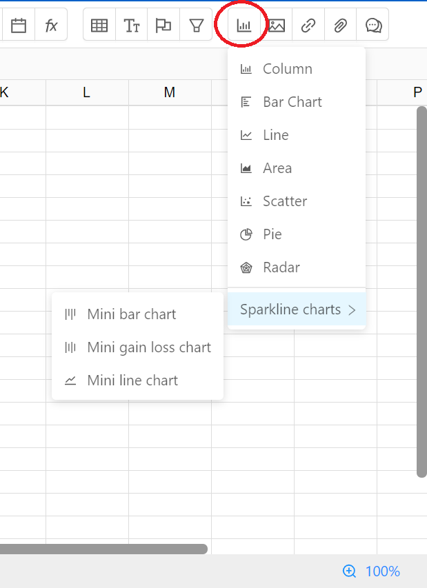
Sheet lets you create charts to visualize a data set. You can find a list of chart types, customization options, and information about charts for your selection of data.
Follow the steps to create the chart for your selected data.
Sheet support the following types
Column charts are used to compare values across categories by using vertical bars. A bar chart is the horizontal version of a column chart. Use a bar chart if you have large text labels.
An area chart is a line chart with the areas below the lines filled with colors. Use a stacked area chart to display the contribution of each value to a total over time.

Pie charts, or circle graphs as they are sometimes known, use pie slices to show the percentage or relative value of the data in the chart.
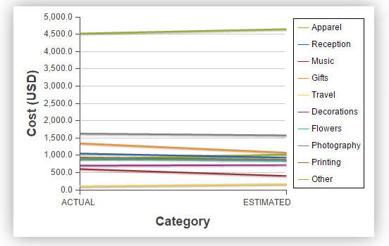
Line charts are used to display trends over time. Use a line chart if you have text labels, dates or a few numeric labels on the horizontal axis.
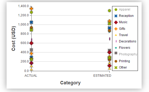
Use a scatter chart (XY chart) to show scientific XY data. Scatter charts are often used to find out if there's a relationship between variable X and Y.
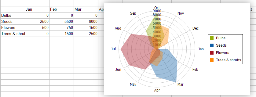
A radar chart, also known as a spider chart or a star chart because of its appearance, plots the values of each category along a separate axis that starts in the center of the chart and ends on the outer ring.
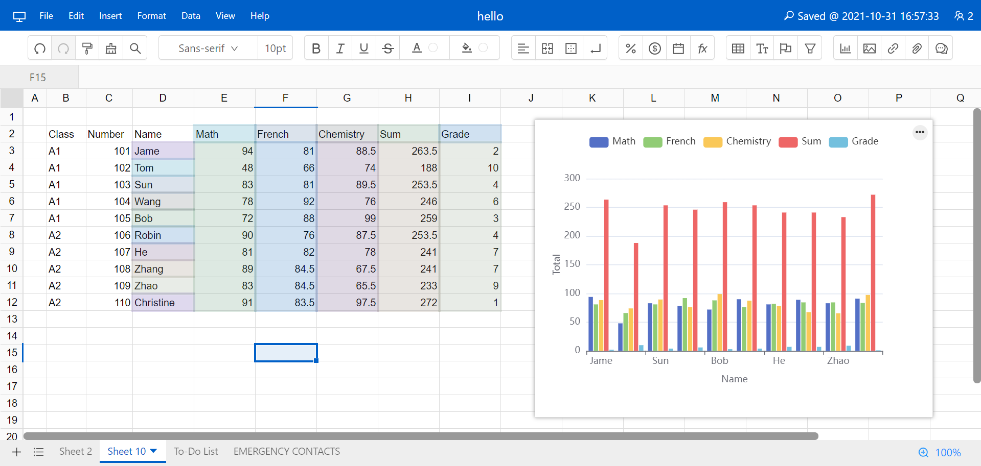
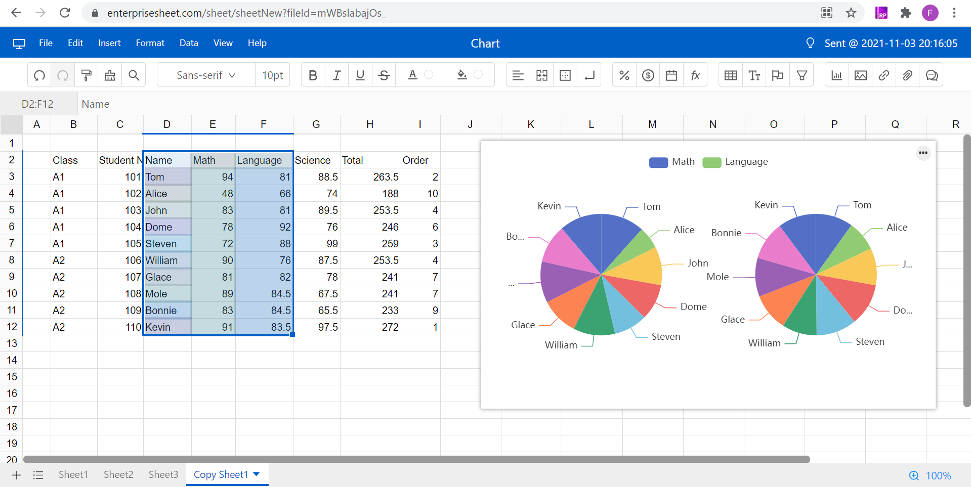
Click the chart and select from top right setting icon, you can edit the generated chart.
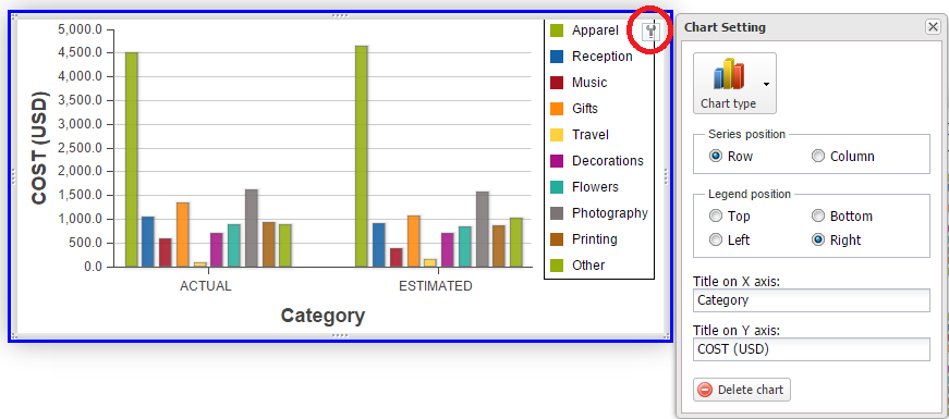
To delete chart, click Delete chart button.