Covid 19 data analyze Example
Ontario's government provides multiple Excels file about Covid19 daily. With CubeDrive, user can easily convert those Excels file into charts, makes the data visualization easier, styles the data with colorful charts and graphs.
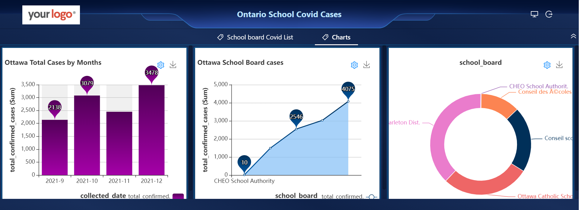
COVID-19 data analyze with Charts
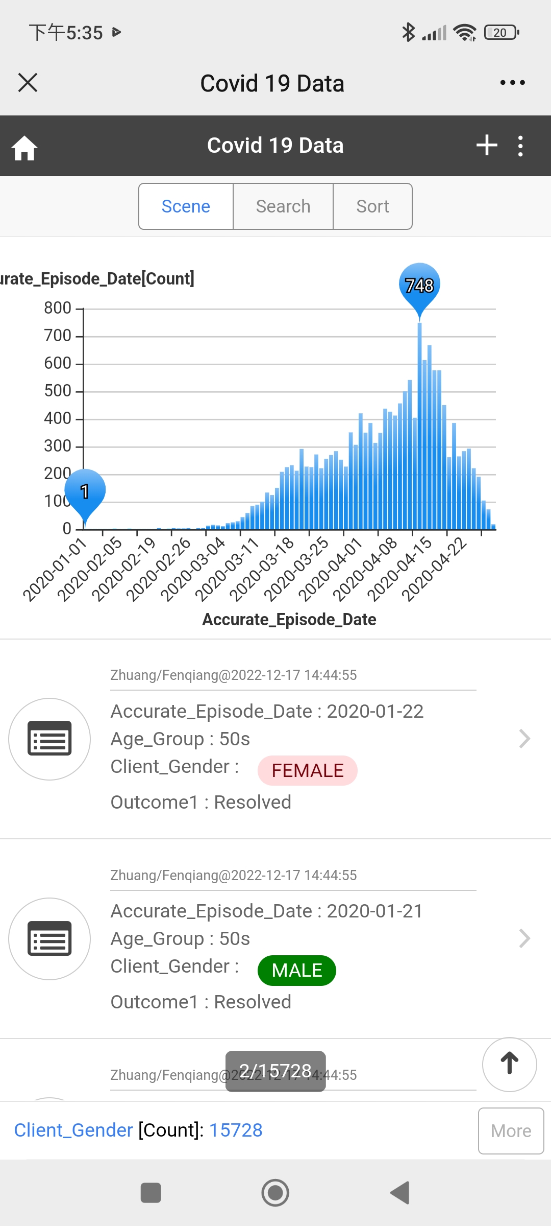
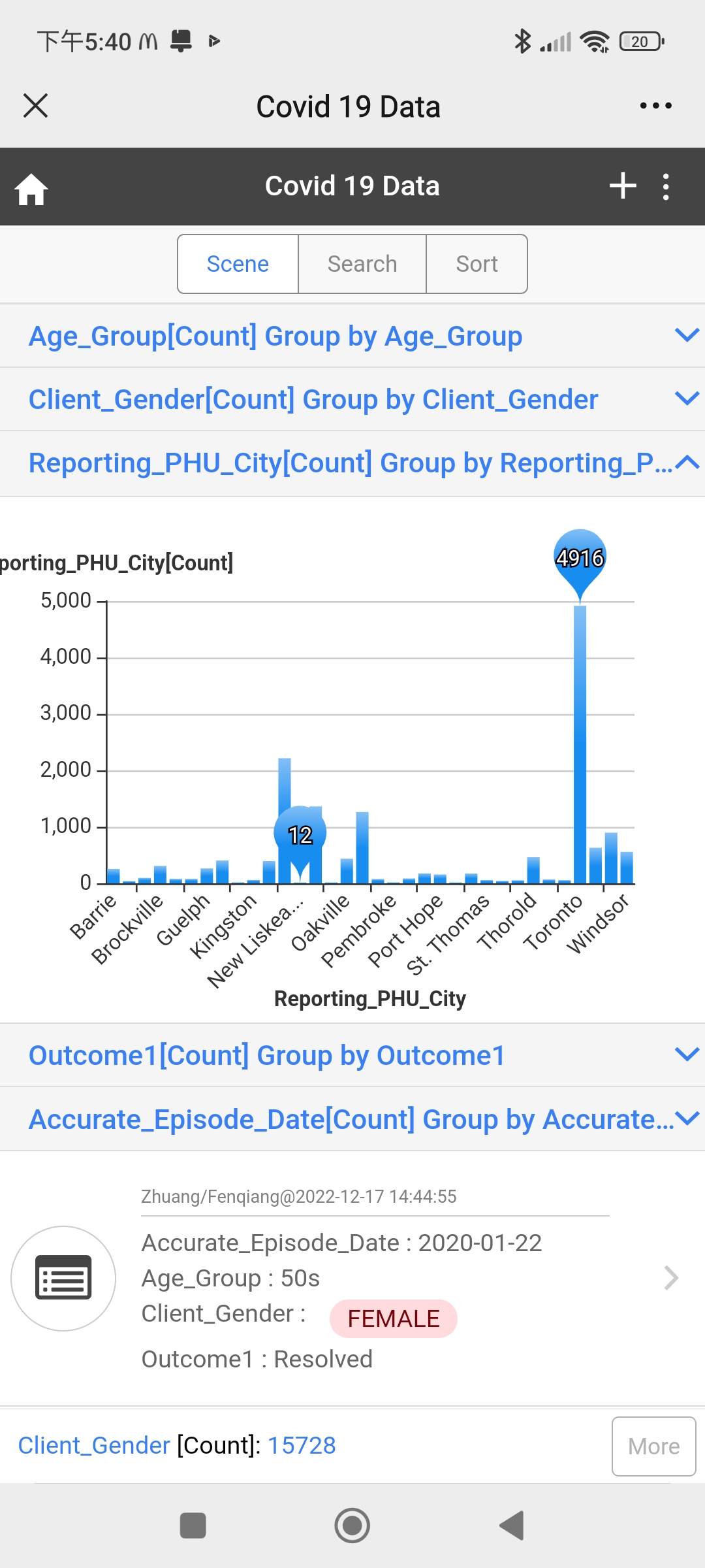
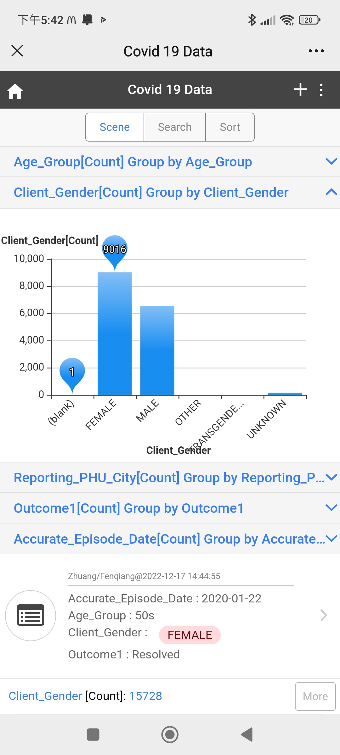
This following charts are generated based on two Excel files which were provided on April 21, 2021. Import the Excels files into the system and process some setting, user can see the data analyze with different charts. From the charts, the following information can be easily concluded:
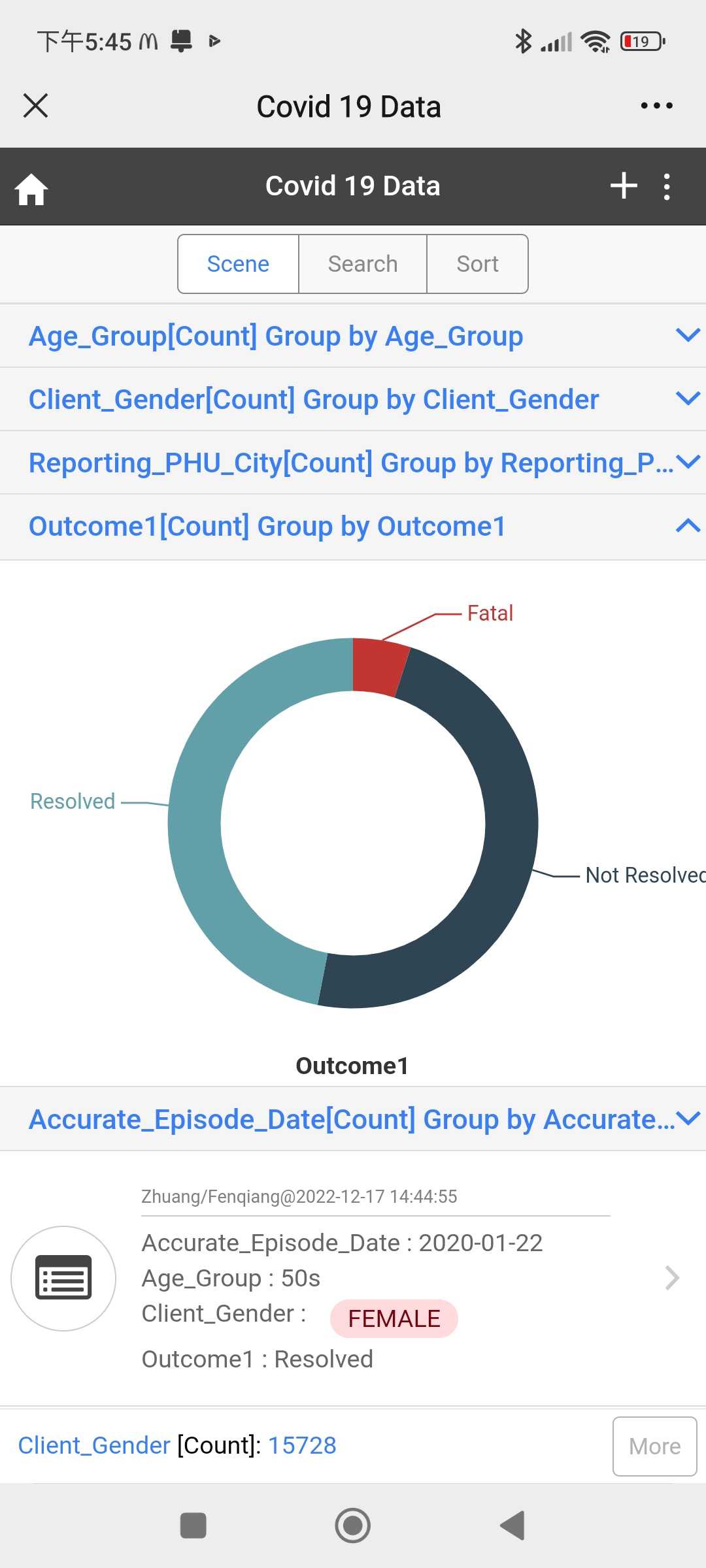
Data analyze the Excel file
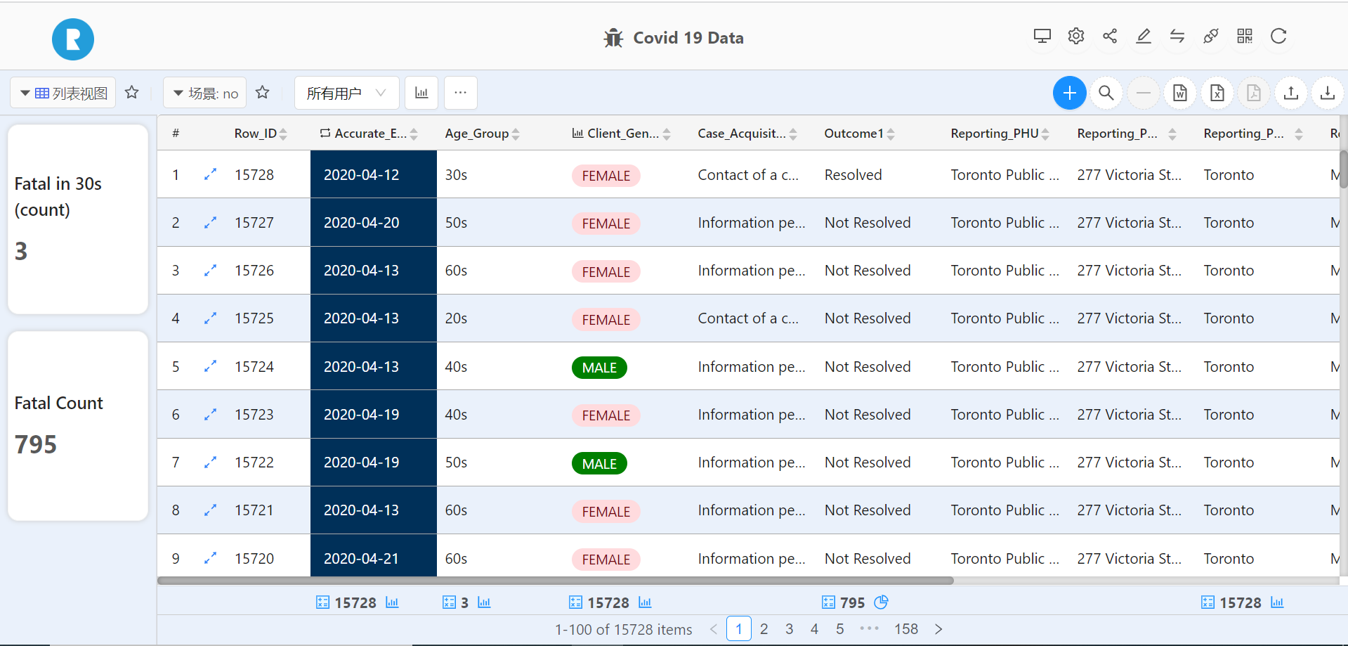
Based on the form data, a list of data analyze can be processed as needed.
If you have Excel file which need to be analyzed, please following the steps to process 【Help document】。